Outline
- Introduction: The “black box” problem in AI and the rise of attention mechanisms.
- Key Concepts: Defining Multi-Head Attention, Softmax scores, and the visualization pipeline.
- Step-by-Step Guide: Extracting attention weights, mapping them to tokens, and normalizing data for display.
- Real-World Applications: Debugging bias, improving RAG (Retrieval-Augmented Generation) performance, and interpretability in legal/medical AI.
- Common Mistakes: Over-interpreting attention, confusing correlation with causation, and the “layer depth” fallacy.
- Advanced Tips: Using Integrated Gradients alongside attention, analyzing head diversity, and pruning heads for efficiency.
- Conclusion: Bridging the gap between performance and transparency.
Visualizing Intelligence: Using Heatmaps to Decode Attention Heads
Introduction
For years, deep learning models—particularly Transformers—have been criticized as “black boxes.” We feed data into one end, receive a prediction from the other, and rarely understand the “why” behind the result. This lack of transparency is a major barrier in sectors like finance, healthcare, and law, where understanding the decision-making process is as important as the outcome itself.
Enter Attention Heatmaps. By visualizing the attention mechanisms that power modern Large Language Models (LLMs), engineers and researchers can peer into the model’s internal focus. Heatmaps transform abstract numerical weights into intuitive visual cues, showing us exactly which words a model considers “important” when generating a response. Mastering this technique allows you to debug hallucinations, identify gender or racial bias, and optimize model architecture with surgical precision.
Key Concepts
To understand how heatmaps work, we must first define the Attention Head. In a Transformer, attention is the mechanism that allows a model to weigh the relevance of different parts of the input data relative to a specific token. Each layer contains multiple “heads,” each specialized to track different linguistic or logical relationships.
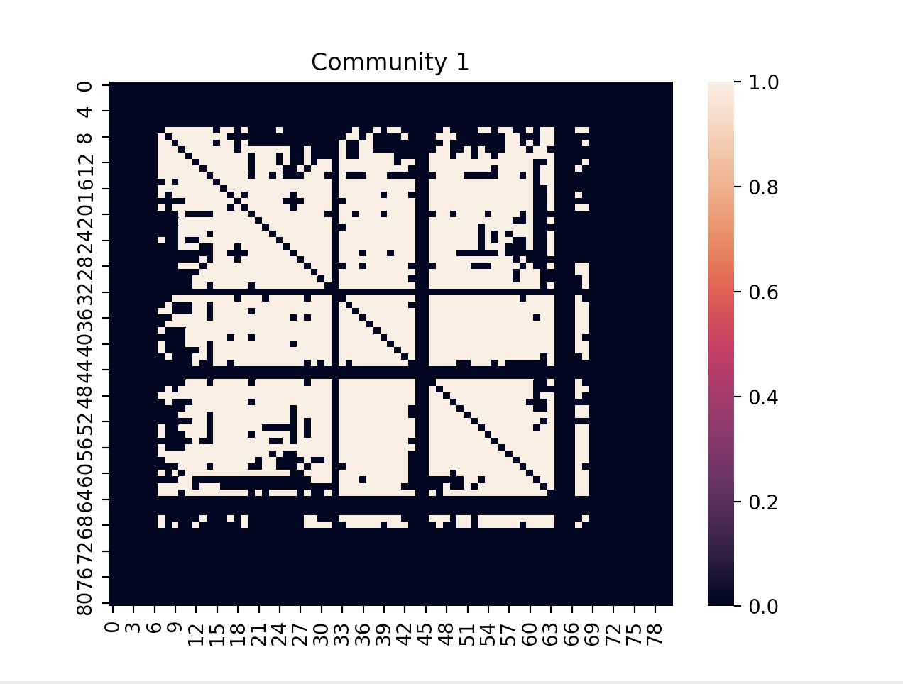
The Attention Matrix: When a model processes a sentence, it calculates a score for every word against every other word. These scores form a matrix. When we convert these scores (often after a softmax normalization) into a heatmap, we are essentially visualizing the “gaze” of the model.
Softmax Scores: The attention score is typically a probability distribution that sums to 1. In a heatmap, higher values (closer to 1.0) appear as high-intensity colors, while lower values fade into the background. This reveals the specific syntactic or semantic dependencies the model relies on—for example, a head might be trained specifically to link a pronoun to its antecedent noun.
Step-by-Step Guide: Generating Your First Attention Heatmap
Generating a heatmap is more than just plotting numbers; it requires a systematic approach to ensure the visualization is meaningful.
- Select Your Model Layer and Head: Don’t try to visualize the entire model at once. Start by isolating a single head in a middle layer. Early layers often focus on basic syntax, while deeper layers capture abstract reasoning.
- Extract the Attention Weights: Use framework-specific hooks (such as register_forward_hook in PyTorch) to intercept the attention tensors during the inference pass. Ensure you capture the weights before they are compressed or discarded.
- Map Weights to Tokens: Align the weight matrix with your input tokens. If you have an input sequence of 10 words, you need a 10×10 matrix. Ensure you handle sub-word tokenization (e.g., Byte Pair Encoding) by either aggregating weights or displaying sub-tokens individually.
- Normalize the Visualization: Raw weights can be noisy. Apply a sliding window or a top-k filter to highlight only the most significant connections. This prevents the “clutter effect” where everything appears equally important.
- Render the Heatmap: Use a library like Matplotlib or Plotly to render the matrix. A diverging color scheme (e.g., blue to red) is ideal for showing the strength of the “attention” connection.
Real-World Applications
Visualizing attention is not merely an academic exercise; it has concrete professional utility.
Debugging RAG Pipelines: In Retrieval-Augmented Generation, models sometimes ignore retrieved context. By generating heatmaps, you can see if the model is actually “looking” at the provided documents or relying on its pre-trained internal biases. If the attention weights for the retrieved chunks are low, your retrieval strategy needs adjustment.
Bias Mitigation: If your model is classifying job applications, you can run a synthetic test with gendered names. If the heatmap shows the model is heavily weighting the name token rather than the experience section, you have identified a clear bias issue that requires retraining or fine-tuning.
Model Pruning: You may find that out of 12 heads, only 3 are consistently firing for a specific task. By identifying these “redundant” heads through heatmaps, you can prune the model to reduce its footprint and latency without sacrificing performance—an essential step for deploying models on edge devices.
Common Mistakes
- Confusing Attention with Causality: Just because a model focuses on a word doesn’t mean that word caused the output. Attention is a correlation mechanism, not a logical proof.
- Ignoring the “Layer Depth” Context: Attributing meaning to a single layer without considering the hierarchy. Lower layers track local syntax (e.g., “The” -> “dog”); higher layers track long-range dependencies (e.g., “The dog” -> “ran”). Treat them differently.
- Over-Smoothing the Data: Using too much normalization can wash out subtle but critical signals. If you are troubleshooting a specific failure case, look at the raw, unfiltered weights first.
Advanced Tips
If you want to take your interpretability work to the next level, move beyond basic heatmaps.
Integrated Gradients: Pair your attention heatmaps with Integrated Gradients (IG). While attention shows where the model is looking, IG shows which tokens actually contributed to the final output prediction. This dual-layered approach gives you a complete picture of the “where” and the “how much.”
Head Diversity Metrics: Use your heatmaps to calculate the “Entropy” of each head. A head with high entropy is looking everywhere at once (and is likely useless), while a head with low entropy is highly focused. Tracking these metrics over time during training allows you to monitor if your model is learning effectively.
Interactive Dashboards: Integrate your heatmaps into a Streamlit or Gradio dashboard. Allowing stakeholders to interact with the model—adjusting inputs and seeing the heatmap update in real-time—is the fastest way to build trust with non-technical users.
Conclusion
Heatmaps generated from attention heads offer a window into the logical architecture of Transformer-based models. They allow us to transform the “black box” into a transparent process, enabling better debugging, enhanced safety, and more optimized deployment.
While attention maps are not a silver bullet for total interpretability, they are an essential tool in your AI toolkit. By systematically visualizing focus areas, you move away from guessing why a model behaves the way it does and toward a data-driven understanding of its internal mechanics. Start small, focus on identifying specific patterns in your data, and use these visual cues to build models that are not just intelligent, but accountable.
Further Reading


Leave a Reply