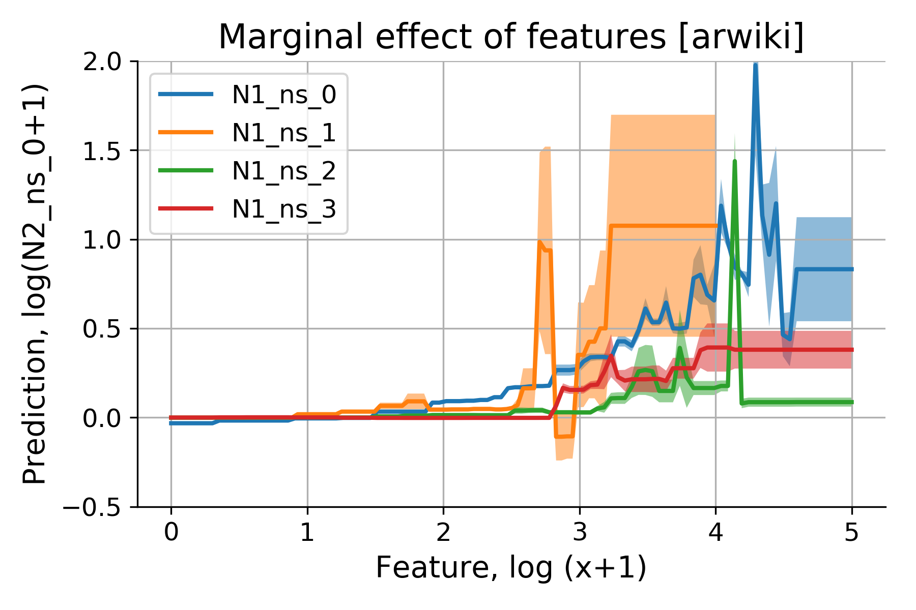
Partial Dependence Plots (PDPs) show the marginal effect of one or two features on the predicted outcome.
— by
Steven Haynes
Demystifying Partial Dependence Plots: Unlocking Interpretability in Machine Learning
Introduction
In the era of “black-box” machine learning, complexity often comes at the cost of transparency. Whether you are using Gradient Boosted Trees, Random Forests, or complex neural networks, stakeholders—from regulatory bodies to product managers—demand to know why a model makes a specific prediction. How do we balance high-performance predictive accuracy with the need for human-understandable logic?
Enter the Partial Dependence Plot (PDP). PDPs are a cornerstone of model-agnostic interpretability. They allow data scientists to visualize the marginal effect of one or two features on the predicted outcome of a model. By isolating the impact of specific variables while accounting for the average influence of all other inputs, PDPs bridge the gap between abstract algorithmic math and actionable business intuition.
Key Concepts
At its core, a Partial Dependence Plot answers a hypothetical question: “If I change the value of feature X while holding the rest of the data constant, how does the model’s prediction change on average?”
The mathematical intuition behind a PDP is built on the concept of marginalization. To calculate the partial dependence of a feature, we take the entire dataset, replace the chosen feature with a fixed value (e.g., “Age = 30”), and run the model across all rows. We then average those predictions. By repeating this for a range of values (e.g., Age 18 through 80), we generate a line or curve that represents the “average” relationship between that feature and the target variable.
PDP vs. Individual Conditional Expectation (ICE): While a PDP shows the average effect, it can mask heterogeneity. ICE plots take the same concept but plot a line for each individual observation. When your PDP shows a flat line, an ICE plot might reveal that the feature has a strong positive effect for half your data and a strong negative effect for the other half. PDPs provide the “bird’s-eye view,” while ICE plots provide the granularity.
Step-by-Step Guide: Implementing PDPs
Implementing PDPs is straightforward if you use standard Python libraries like scikit-learn or PyCEbox. Follow these steps to build your own analysis.
Select your target features: Start by identifying the 1–3 most important features based on your model’s feature importance scores (e.g., Gini importance or SHAP values).
Define the feature space: Determine the grid of values you want to evaluate. For continuous variables, pick a range from the 5th to the 95th percentile to avoid being skewed by outliers.
Run the Partial Dependence function: Use sklearn.inspection.partial_dependence to calculate the marginal effects. This function automates the process of replicating your dataset for every grid point.
Visualize the result: Plot the grid points on the X-axis and the average predicted output on the Y-axis.
Add a rug plot: Always include a “rug” (small vertical ticks) at the bottom of your plot. These represent the distribution of your actual data points. It prevents you from over-interpreting areas of the plot where you have little to no actual data.
Examples and Real-World Applications
PDPs are invaluable across various high-stakes industries. Here is how they are applied in practice:
Finance: Credit Scoring
Imagine a model predicting the probability of loan default. A PDP for “Annual Income” might show that default risk drops sharply as income increases, but plateaus after a certain threshold (e.g., $150k). This allows risk officers to see if the model’s logic aligns with internal risk policies. If the model shows a “U-shaped” curve where high earners suddenly become high-risk, you have likely identified a data bias or a sign of model overfitting.
Healthcare: Patient Readmission Rates
In a model predicting hospital readmission, a PDP for “Days Spent in Hospital” can reveal the non-linear relationship between treatment duration and recovery. You might find that risk decreases up to 7 days, but increases afterward (perhaps due to hospital-acquired infections). This insight helps clinical staff optimize discharge planning.
Marketing: Customer Churn
A PDP for “Number of Customer Support Tickets” can help executives identify the “tipping point” of frustration. By visualizing this, the marketing team can trigger proactive outreach campaigns exactly when the model predicts the probability of churn begins to spike, rather than waiting until the customer is already lost.
Common Mistakes
While powerful, PDPs are prone to misinterpretation if not handled carefully.
Ignoring Feature Correlation: This is the most dangerous trap. PDPs assume that the features are independent. If “Age” and “Years of Experience” are highly correlated, the “marginalization” process will create impossible, fake data points (e.g., a 20-year-old with 40 years of experience). This results in biased, misleading plots.
Over-interpreting Sparse Data: If your plot shows a wild spike in the prediction at the extreme end of the X-axis, check the rug plot. If there are no data points there, your model is likely just extrapolating noise, not finding a real trend.
Confusing Correlation with Causation: A PDP shows what the model has learned from the data, not necessarily the physical reality of the world. If the model is biased, the PDP will visualize that bias perfectly.
Advanced Tips
To take your analysis to the next level, consider these strategies:
Use 2D PDPs for Interactions: If you suspect two features are working together, use a 2D Partial Dependence Plot. This maps two features on the X and Y axes and uses a contour plot or heatmap to show the predicted outcome. This is the best way to uncover interaction effects, such as how “Interest Rate” and “Loan Term” interact to influence default risk.
Center your plots: When comparing models, it is often helpful to “center” your PDP curves. By subtracting the average prediction from the entire curve, you can focus on the *relative* change rather than the absolute probability. This makes it easier to compare the “shape” of how different models interpret a feature.
Combine with SHAP: Use PDPs for understanding global, long-term trends, but complement them with SHAP (SHapley Additive exPlanations) values to explain individual, unique predictions. Think of PDPs as the “Strategic View” and SHAP as the “Tactical View.”
Conclusion
Partial Dependence Plots are essential tools for any practitioner looking to open the black box of machine learning. By mapping the marginal influence of your features, you gain more than just a model—you gain insight. You move from saying “the model predicts this” to explaining “the model relies on these specific relationships to make its decisions.”
Remember that interpretability is a journey, not a destination. Always validate your PDP findings against domain expertise, check for feature correlations, and ensure you are looking at enough data points to make the visual reliable. When used correctly, PDPs act as the ultimate diagnostic tool, fostering trust between your models and the business stakeholders who depend on them.


Leave a Reply