Attention visualization identifies which segments of input data, such as tokens in text, receive higher weights.
— by
Steven Haynes
Outline:
1. Introduction: The “Black Box” problem in AI and why transparency matters.
2. Key Concepts: The mechanics of the Attention Mechanism (Query, Key, Value) and how visualization translates these matrices into heatmaps.
3. Step-by-Step Guide: How to implement visualization using tools like BertViz or Captum.
4. Real-world Applications: Bias detection in LLMs, debugging translation errors, and model interpretability for compliance.
5. Common Mistakes: Misinterpreting attention as “explanation” (the correlation vs. causation trap).
6. Advanced Tips: Leveraging Attention Rollout and integrated gradients for more nuanced insights.
7. Conclusion: The future of explainable AI (XAI).
Modern Large Language Models (LLMs) and Transformer-based architectures are remarkably powerful, yet they remain notoriously opaque. When a model generates a sophisticated summary or classifies a sentiment, it often feels like a magic trick. We see the input and the output, but the “reasoning” process remains locked inside a complex web of millions—or billions—of parameters. This lack of transparency is a major hurdle for industries requiring accountability, such as law, medicine, and finance.
Attention visualization changes this dynamic. By illuminating which parts of an input sequence a model is “looking at” when making a prediction, we can finally peer inside the black box. This practice doesn’t just satisfy intellectual curiosity; it is a critical diagnostic tool for identifying bias, troubleshooting errors, and ensuring that AI models are functioning as intended.
Key Concepts
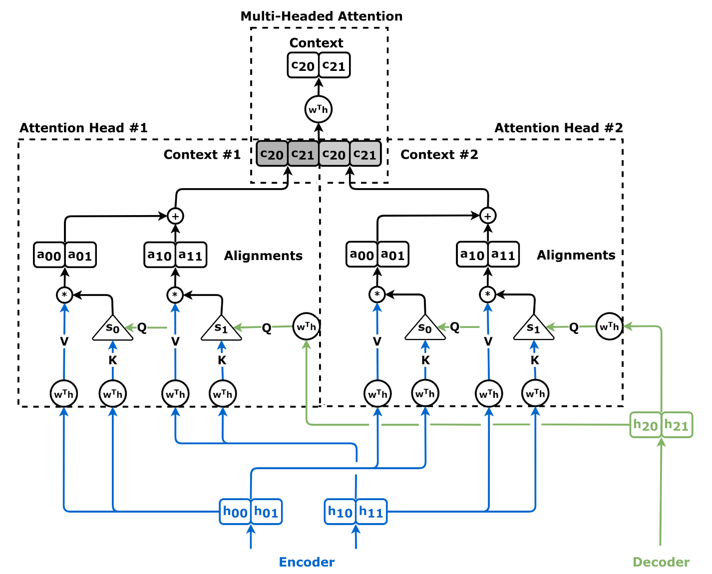
At the heart of the Transformer architecture is the Attention Mechanism. To visualize it, we must first understand how it works mathematically. During the processing of a sequence, the model creates three vectors for each token: Queries, Keys, and Values.
The attention score is calculated by taking the dot product of the Query (what the model is looking for) and the Key (what each token represents). This score determines how much focus or “weight” the model should place on a specific token relative to the current task. These scores are normalized into a probability distribution, effectively creating a map of importance.
Attention visualization is the process of extracting these probability matrices and representing them visually, usually as heatmaps. If you look at a sentence like “The bank manager deposited money,” the attention head responsible for context might assign a high weight to “bank” when the model processes “money.” Visualization tools render these relationships as color-coded intensities, allowing us to see exactly which words are driving the model’s linguistic associations.
Step-by-Step Guide
Translating raw numerical weights into actionable data requires a structured approach. Here is how you can implement attention visualization in your development workflow:
Select the right library: For PyTorch-based models, the Captum library is the industry standard for model interpretability. For specific Transformer visualizations, BertViz provides out-of-the-box support for visualizing attention heads in models like BERT, GPT-2, and RoBERTa.
Extract the attention weights: Configure your model to output hidden states and attention weights during the forward pass. In Hugging Face transformers, this is often as simple as setting output_attentions=True in the model configuration.
Generate the heatmap: Feed your target text into the model. Use your chosen tool to generate an adjacency matrix where the x-axis represents the tokens currently being processed, and the y-axis represents the tokens they are attending to.
Aggregate across heads: A model might have dozens of attention heads. Use aggregation techniques to view the “mean attention” across all heads, or isolate individual heads to identify specific linguistic behaviors (e.g., one head may track grammatical dependencies, while another tracks factual entities).
Analyze for anomalies: Look for “stray” attention. If a model is classifying a legal document but is focusing heavily on irrelevant stop-words (like “the” or “and”), your model may be over-fitting to noise rather than identifying substantive content.
Real-world Applications
The utility of attention visualization spans across several high-stakes domains:
Bias Detection: Developers use visualization to check if a model exhibits gender or racial bias. For example, if a model consistently links stereotypical occupations to specific gendered pronouns, visualization can highlight exactly which tokens are triggering those biased associations, allowing for data-centric remediation.
Debugging Translation Errors: In machine translation, attention visualization shows if the model is correctly mapping a noun in a source language to its corresponding verb in the target language. If the attention is scattered, the translator can diagnose that the model needs more fine-tuning on specific syntax structures.
Compliance and Governance: In highly regulated sectors like banking, models must be “explainable.” If an AI denies a loan, developers can use visualization to demonstrate that the decision was based on valid financial inputs (like “debt” or “income”) rather than protected attributes, providing a transparent audit trail.
Common Mistakes
Confusing Correlation with Causation: This is the most significant pitfall. Just because a model places high “attention” on a specific word doesn’t mean that word was the sole cause of the output. Attention is a proxy for importance, not a definitive map of the model’s logic.
Ignoring the “Aggregation” Problem: Looking at a single attention head can be misleading. Modern Transformers have many heads, and their combined effect is what drives the output. Always look at the model-wide view before drawing conclusions from a single layer.
Over-reliance on Visualization: Visualization is a diagnostic tool, not a performance metric. A “pretty” heatmap where attention flows logically does not necessarily mean the model is accurate; it only means the attention is interpretable.
Advanced Tips
To gain a more profound understanding of model behavior, move beyond simple heatmap visualization.
Attention Rollout: Standard attention weights only show the relationship within a single layer. Because Transformers have multiple layers, the information flows through the network in complex paths. Attention Rollout is a technique that computes the flow of attention across all layers, providing a much more accurate picture of which input features contribute to the final hidden state.
Integrated Gradients: While attention tells you where the model is looking, Integrated Gradients (IG) tell you which features actually influence the output prediction. Combining IG with attention visualization creates a powerful “dual-view” approach: one tells you the focus, the other tells you the impact. This helps you identify if the model is looking at the right things for the right reasons.
Pro Tip: Use visualization tools during the training phase, not just after deployment. By monitoring attention patterns during fine-tuning, you can catch the model “memorizing” specific training examples before it becomes a permanent part of the model’s weights.
Conclusion
Attention visualization is more than just a developer’s toy; it is an essential component of responsible AI engineering. By stripping away the layers of abstraction, we can see how models connect information, how they stumble over bias, and where they rely on spurious correlations.
As we continue to integrate AI into critical systems, our ability to interpret, audit, and debug these models will determine their success. Start by visualizing your models today—the insights you gain will likely change the way you train and deploy them tomorrow. The goal is no longer just to build models that work, but to build models that we truly understand.


Leave a Reply