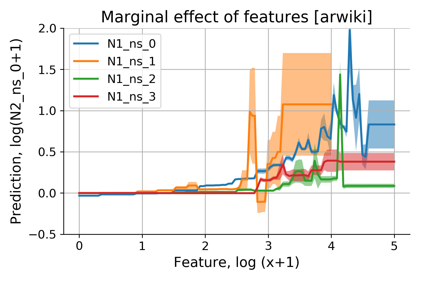
Partial Dependence Plots (PDP) illustrate the marginal effect of features on model predictions.
— by
Steven Haynes
Contents
1. Introduction: The “Black Box” problem in machine learning and how interpretability leads to trust.
2. Key Concepts: Defining Partial Dependence Plots (PDPs) as a marginal effect visualization tool.
3. Step-by-Step Guide: How to compute and interpret PDPs in a data science workflow.
4. Real-World Applications: Use cases in credit scoring, healthcare, and predictive maintenance.
5. Common Mistakes: The pitfalls of correlation vs. causation and the impact of feature interaction.
6. Advanced Tips: Moving beyond univariate PDPs to Individual Conditional Expectation (ICE) curves.
7. Conclusion: Balancing accuracy and transparency.
***
Demystifying Machine Learning: How Partial Dependence Plots Unmask Model Logic
Introduction
Modern machine learning models, particularly ensemble methods like Random Forests and Gradient Boosting machines, are incredibly powerful. They can discern complex, non-linear relationships that traditional statistical models often miss. However, this power comes at a cost: the “Black Box” problem. When a model predicts that a loan applicant is high-risk, we often lack a clear understanding of why.
For data scientists and business stakeholders alike, this lack of transparency is a significant hurdle. If we cannot explain a model’s behavior, we cannot validate it, trust it, or comply with regulatory requirements. This is where Partial Dependence Plots (PDPs) become an essential tool in your analytical toolkit. By isolating the impact of a single feature on the model’s prediction, PDPs bridge the gap between high-performance predictive modeling and human-readable explanation.
Key Concepts
A Partial Dependence Plot is a global interpretability tool that shows the marginal effect of one or two features on the predicted outcome of a machine learning model. In essence, it tells us: “If we hold all other variables constant, how does changing the value of Feature X affect the average prediction of our model?”
The core philosophy behind the PDP is marginalization. To calculate the partial dependence of a feature, we take a dataset and systematically replace the values of that feature with a specific range of values, while leaving all other features untouched. We then pass these modified rows through our trained model and calculate the average prediction for each value in that range.
The resulting plot shows the relationship between the feature and the model’s output. A flat line suggests that the feature has no influence on the prediction, while a rising or falling curve indicates a positive or negative correlation. Complex shapes, such as U-curves or S-curves, reveal non-linear dependencies that simple linear models would fail to capture.
Step-by-Step Guide
Implementing PDPs in a Python-based workflow using libraries like Scikit-Learn is straightforward. Follow these steps to generate and interpret your insights:
Train your model: Ensure your model (e.g., XGBoost, LightGBM, or Scikit-Learn RandomForest) is fully trained on your dataset. PDPs are model-agnostic, meaning they work with any predictive algorithm.
Select the target feature: Choose the feature you wish to analyze. Start with features known to have high feature importance scores to validate if their impact aligns with business logic.
Define the grid: Create a range of values for your target feature. For numerical features, select percentiles (e.g., 5th to 95th) to ensure your analysis focuses on the most frequent data points.
Compute the marginal effects: Use a library function (such as sklearn.inspection.PartialDependenceDisplay) to perform the computation. The algorithm will iterate through your grid, replace the feature values, and aggregate the predictions.
Visualize the result: Plot the values on the x-axis and the average predicted output on the y-axis. Use a confidence interval if possible to show the variance across your data distribution.
Sanity check: Compare the plot against domain knowledge. If a model shows that “Age” decreases life expectancy after 20 years of age, you likely have a data leakage issue or a biased training set.
Examples or Case Studies
PDPs are invaluable across various industries where decision-making must be defensible:
Credit Scoring: In the financial sector, lenders must explain why a loan was denied. A PDP for “Annual Income” might show a steep increase in loan approval probability up to $80,000, followed by a plateau. If the PDP shows a dip in approval for high-income earners, it might signal that the model is overfitting on specific outliers or training data noise.
Healthcare Diagnostics: Consider a model predicting the probability of disease. A PDP for “Blood Glucose Level” can demonstrate the exact threshold where the risk of diabetes begins to spike sharply. Doctors can use this to understand the model’s clinical logic, ensuring it aligns with established medical guidelines.
Predictive Maintenance: In manufacturing, a model might predict machine failure based on temperature and vibration sensors. A PDP for “Vibration Frequency” might reveal a critical “elbow point” where the risk of failure increases exponentially, providing maintenance teams with a clear operational limit to monitor.
Common Mistakes
Even with a robust tool like PDP, misinterpretation is common. Watch out for these pitfalls:
Ignoring Correlation: The biggest assumption in PDP is that the target feature is independent of other features. If “Age” and “Years of Experience” are highly correlated, the PDP for “Age” might generate unrealistic data points (e.g., an 18-year-old with 30 years of experience), leading to misleading predictions.
Hiding Interactions: PDPs show the average effect. If a feature impacts the prediction differently depending on the value of another feature, the PDP will “smooth out” these effects into an average, potentially hiding important nuanced behavior.
Over-Extrapolation: Always keep your grid values within the range of the original data. If you plot a range that includes values outside the training distribution, your model will be forced to make predictions in “unknown territory,” leading to erratic and unreliable plot lines.
Advanced Tips
To take your model interpretability to the next level, consider these strategies:
Use Individual Conditional Expectation (ICE) Curves: While a PDP shows the average effect, ICE curves show the effect for each individual data point. By plotting ICE curves, you can spot heterogeneities in your model’s behavior—instances where certain subgroups react differently to a feature change than the rest of the population.
Two-Way PDPs: Sometimes, the interaction between two features is more important than the individual effect. A two-way PDP uses a heatmap to show how two features jointly influence the prediction. This is excellent for identifying synergistic effects, such as how “Marketing Spend” and “Seasonality” combined drive sales volume.
Center your plots: In many use cases, the absolute value on the y-axis is less important than the change in prediction. By centering the PDP at the minimum value, you make it easier to compare the magnitude of influence across different features, even if they operate on different scales.
Conclusion
Partial Dependence Plots are a cornerstone of transparent machine learning. By providing a clear, visual representation of how features drive model predictions, they transform black-box algorithms into explainable, actionable assets. They allow practitioners to validate model logic, uncover hidden biases, and satisfy regulatory transparency requirements.
However, interpretability is not a one-size-fits-all endeavor. Always combine PDPs with other methods like SHAP values or LIME for a more comprehensive view of local and global model behavior. As machine learning continues to integrate into high-stakes environments, the ability to explain what your model is doing—and why—will become just as important as the accuracy of the model itself.

 plots reveal variations in predictions for individual instances.")


 plots visualize the dependence of predictions on a feature for individual instances.")
Leave a Reply