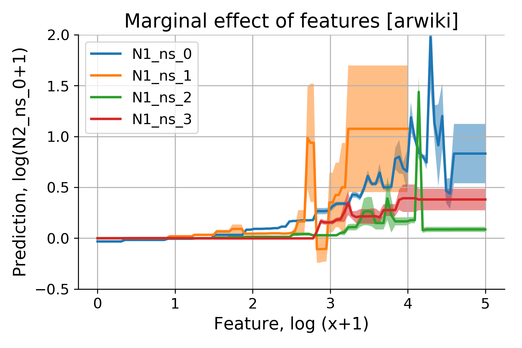
Partial Dependence Plots (PDPs) show the marginal effect of one or two features on the predicted outcome.
— by
Steven Haynes
Unmasking the Black Box: A Practical Guide to Partial Dependence Plots
Introduction
In the modern data landscape, we are increasingly reliant on high-performing machine learning models like Random Forests, Gradient Boosted Trees, and Neural Networks. While these models often provide state-of-the-art predictive accuracy, they frequently operate as “black boxes.” We know they work, but we rarely understand why they arrive at specific conclusions.
This lack of transparency poses a significant challenge for stakeholders who need to trust model outputs, ensure regulatory compliance, or debug potential biases. This is where Partial Dependence Plots (PDPs) become an essential tool in your data science arsenal. PDPs allow you to visualize and understand the marginal effect of one or two features on the predicted outcome of a machine learning model, effectively bridging the gap between complexity and interpretability.
Key Concepts
At its core, a Partial Dependence Plot shows the relationship between a target feature and the predicted output of a model, while marginalizing (or “averaging out”) the effects of all other input features.
Think of it this way: if you want to know how “Square Footage” affects “House Price” in a complex model, a PDP asks the model: “What would the predicted price be if I kept every house in my dataset at its current state, but changed the square footage to 1,000? Then to 2,000? Then to 3,000?” By averaging these predictions, you isolate the specific impact of the variable in question.
Key characteristics of PDPs include:
Marginal Effects: They isolate the average change in prediction as the feature varies.
Feature Interaction: While 1D plots show the effect of a single feature, 2D PDPs allow you to visualize the interaction between two features simultaneously, such as how “Age” and “Income” together influence “Credit Risk.”
Model Agnostic: PDPs work with any supervised learning model, making them a universal tool for model diagnostics.
Step-by-Step Guide
Implementing PDPs is relatively straightforward using modern Python libraries like scikit-learn or PDPbox. Follow these steps to generate your first analysis:
Select your target feature: Choose the variable you want to investigate. This should be a feature that you suspect has a significant influence on your model’s predictions.
Define the range: Determine the range of values for your chosen feature. Usually, the library will automatically calculate this based on the distribution of your data (e.g., from the 5th percentile to the 95th percentile).
Generate grid points: The algorithm creates a set of values across the range of your feature. If you are analyzing “Interest Rate,” it might create points at 2%, 3%, 4%, and so on.
Perform synthetic predictions: For every point on your grid, the algorithm copies your entire dataset, replaces the chosen feature with the specific grid point value, and passes this entire “modified” dataset through the model.
Calculate the mean: The model generates a prediction for every row in the modified dataset. The algorithm then calculates the average of these predictions. This average represents the y-axis value for that specific point on the grid.
Plot the results: Map the grid points to their corresponding average predictions to visualize the trend line.
Examples and Real-World Applications
To truly appreciate PDPs, consider how they function in high-stakes industries:
“A bank uses a Gradient Boosting Machine to approve loans. While the model is highly accurate, compliance officers demand to know if the model is relying on prohibited demographic data. By running a PDP on ‘Debt-to-Income Ratio’ and ‘Credit Score,’ the data science team demonstrates that the model follows rational, policy-approved patterns, ensuring transparency and fairness.”
Predictive Maintenance: In manufacturing, engineers use sensors to predict machine failure. A PDP can reveal that the probability of failure spikes once a component’s temperature exceeds a specific threshold, providing an actionable insight for setting maintenance alerts.
Marketing Personalization: A retailer wants to optimize discount offers. By plotting a PDP of “Discount Percentage” against “Conversion Probability,” they might discover that conversion rates flatten out after 20%. This prevents them from unnecessarily offering 30% or 40% discounts, directly protecting profit margins.
Common Mistakes
While powerful, PDPs are not immune to user error. Avoid these common pitfalls to ensure your interpretations remain accurate:
Ignoring Feature Correlation: This is the most critical mistake. PDPs assume that features are independent. If two features are highly correlated (e.g., “Years of Experience” and “Salary”), the PDP might generate synthetic data points that are physically impossible—like a person with 30 years of experience but a salary of $20,000—leading to misleading model behavior.
Misinterpreting Heterogeneous Effects: PDPs show the average effect. If a feature has a positive effect on one subset of your data but a negative effect on another, the PDP might show a flat line, hiding the true nature of the relationship.
Overlooking Data Density: A PDP will plot a line across the entire range of your feature, even if there is very little data in certain areas. Always overlay a “rug plot” or histogram to ensure the conclusions you draw are supported by a sufficient volume of data.
Advanced Tips
To move beyond basic interpretation, consider these advanced strategies:
Use 2D Interaction Plots: Use contour or heat maps to visualize the interaction between two features. This is invaluable when the effect of one variable changes based on the value of another—for example, how the impact of “Advertising Spend” on “Sales” changes depending on the “Seasonality.”
Combine with ICE Plots:Individual Conditional Expectation (ICE) plots show the predictions for each individual instance. By layering ICE plots behind your PDP, you can visualize the variance within the population. If the individual lines diverge significantly from the average line (the PDP), it suggests that your model has strong feature interactions that the PDP might be oversimplifying.
Use Centering: Center your PDPs so that the plot starts at zero. This allows you to see the relative change in prediction rather than the absolute value, which is often more helpful when comparing different features against one another.
Conclusion
Partial Dependence Plots are an essential bridge between the raw predictive power of complex machine learning models and the human need for understanding and accountability. By isolating how individual features drive outcomes, you can validate your model’s logic, identify potential biases, and extract actionable business insights that go far beyond simple accuracy metrics.
However, the value of a PDP lies in its proper application. Always remember to consider feature correlations, account for data density, and supplement your analysis with other interpretability methods like ICE plots or SHAP values when necessary. Master these tools, and you will transform your models from opaque black boxes into transparent, trustworthy drivers of organizational success.
The Illusion of Certainty: Why Interpretable Models Are Only Half the Battle – TheBossMind
[…] a single variable’s impact, we have explained the model itself. As highlighted in this practical guide to Partial Dependence Plots, these tools are indispensable for visualizing marginal effects. Yet, there is a systemic danger in […]
 plots visualize the dependence of predictions on a feature for individual instances.")


Leave a Reply